


2025 // Chick-fil-A, Inc. and Brand Apart
Sub-Brand Identity and Creative Direction
Visual Identity
Creative Direction
Project Management
Print Design
Digital Design
Merch Design
-
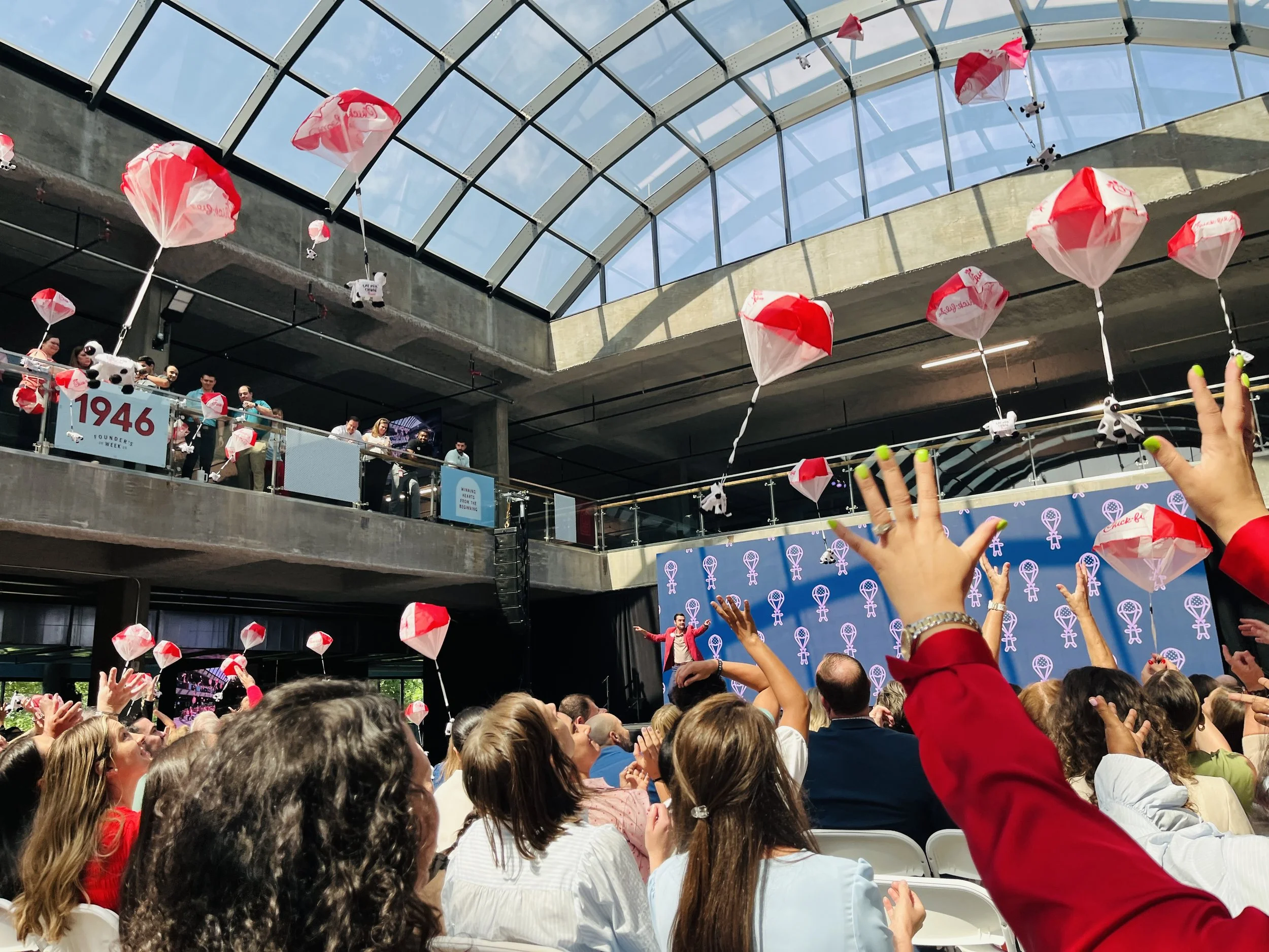
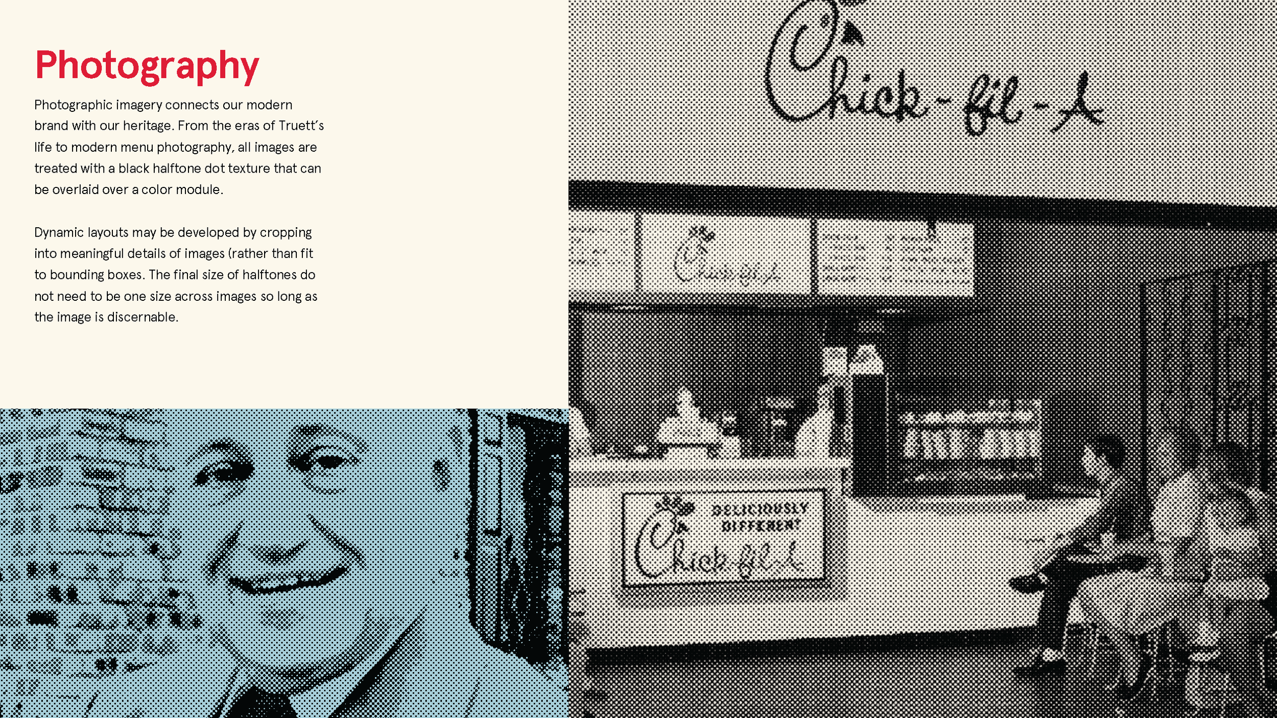
Each year, Chick-fil-A takes time to reflect on the life and legacy of founder S. Truett Cathy.
The one-day celebration on the anniversary of the Dwarf Grill (Cathy’s first restaurant) opening in 1946, Founder’s Week is now the week-long celebration across Chick-fil-A’s Atlanta, California, and International campuses, both in-person and via virtual channels.
-
Align the scattered brand elements of past Founder’s Weeks to the Chick-fil-A parent brand.
Create distinction by connecting parent brand visual elements with callbacks to Chick-fil-A heritage.
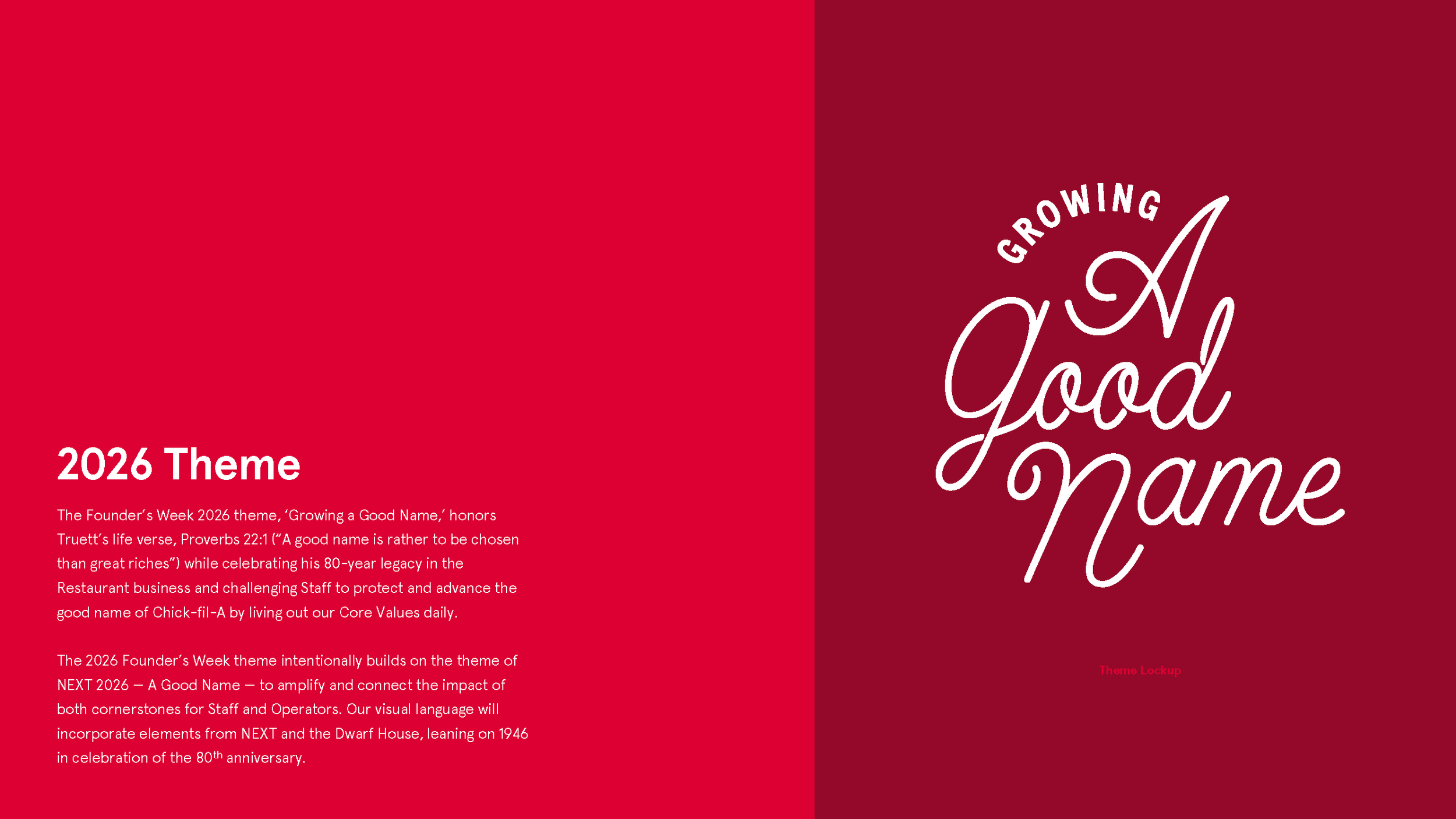
Connect event branding to this year’s theme: “WINNING HEARTS from the BEGINNING,” a reference to the brand’s “Winning Hearts Every Day” customer success strategy.
-
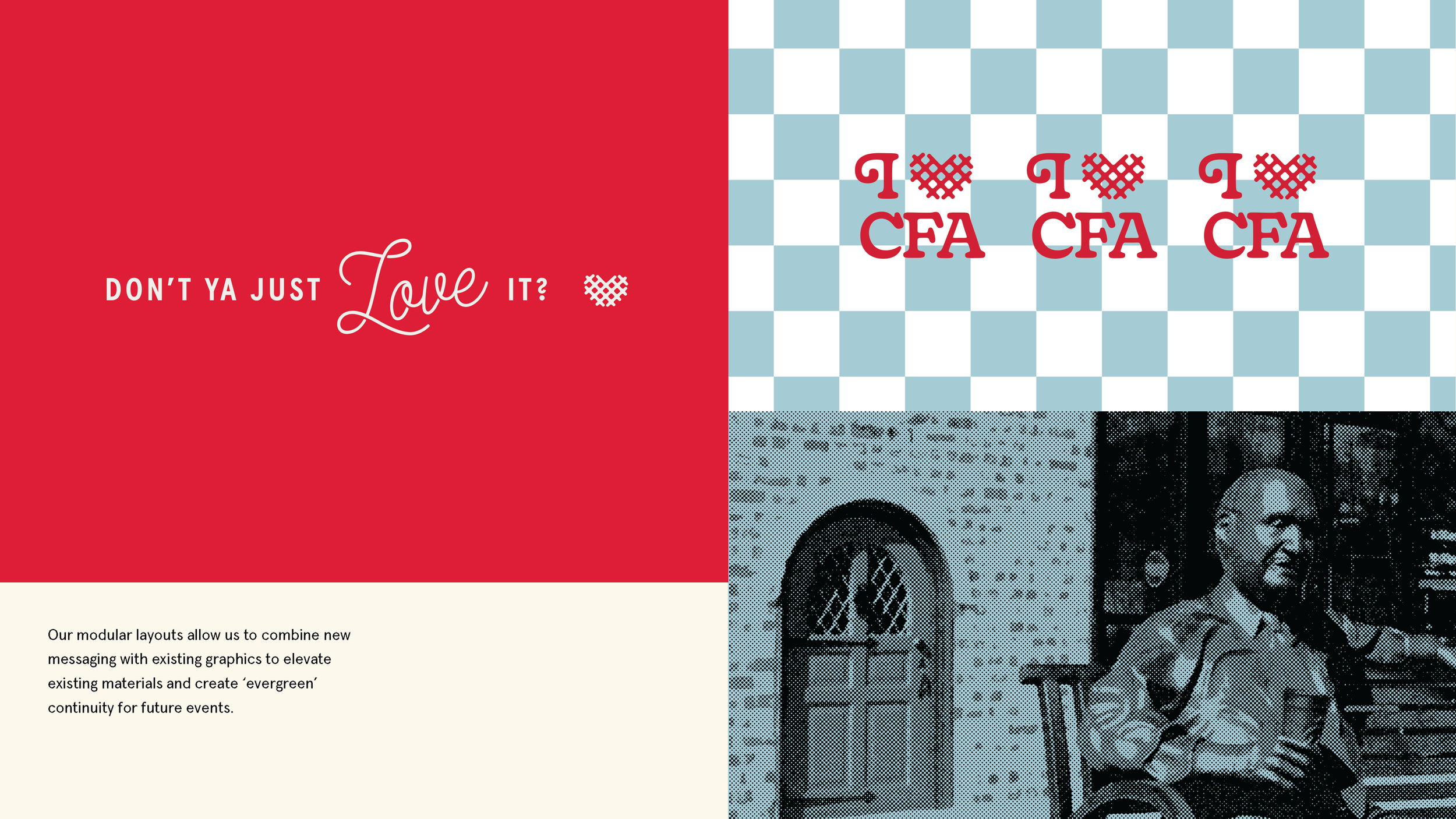
Connect familiar Chick-fil-A parent brand elements to the fun, classic Americana aesthetic of the Dwarf Grill and its original little blue menu.
Utilize the Waffle Potato Fry Heart icon strategically to align Founder’s Week theme to the “WINNING HEARTS EVERY DAY” customer success strategy.
Create opportunities for engagement over the course of the week via craveable limited run merch and tie-ins.
Creative Strategy
A week-long celebration sounds great on paper, but increased access to events means spread resources and split participation. In a busy hybrid work world, our partners on the Chick-fil-A Culture team realized the event would need to feel worthwhile to attract the consistent crowd they were hoping for.
‘We want this to feel like the campus at Christmastime — Operators, Staff, and
Chick-fil-A Alumni should feel a noticeable magic in the air.’We liked that challenge — to take the workplace that already feels like Disneyland and make it feel even more special.
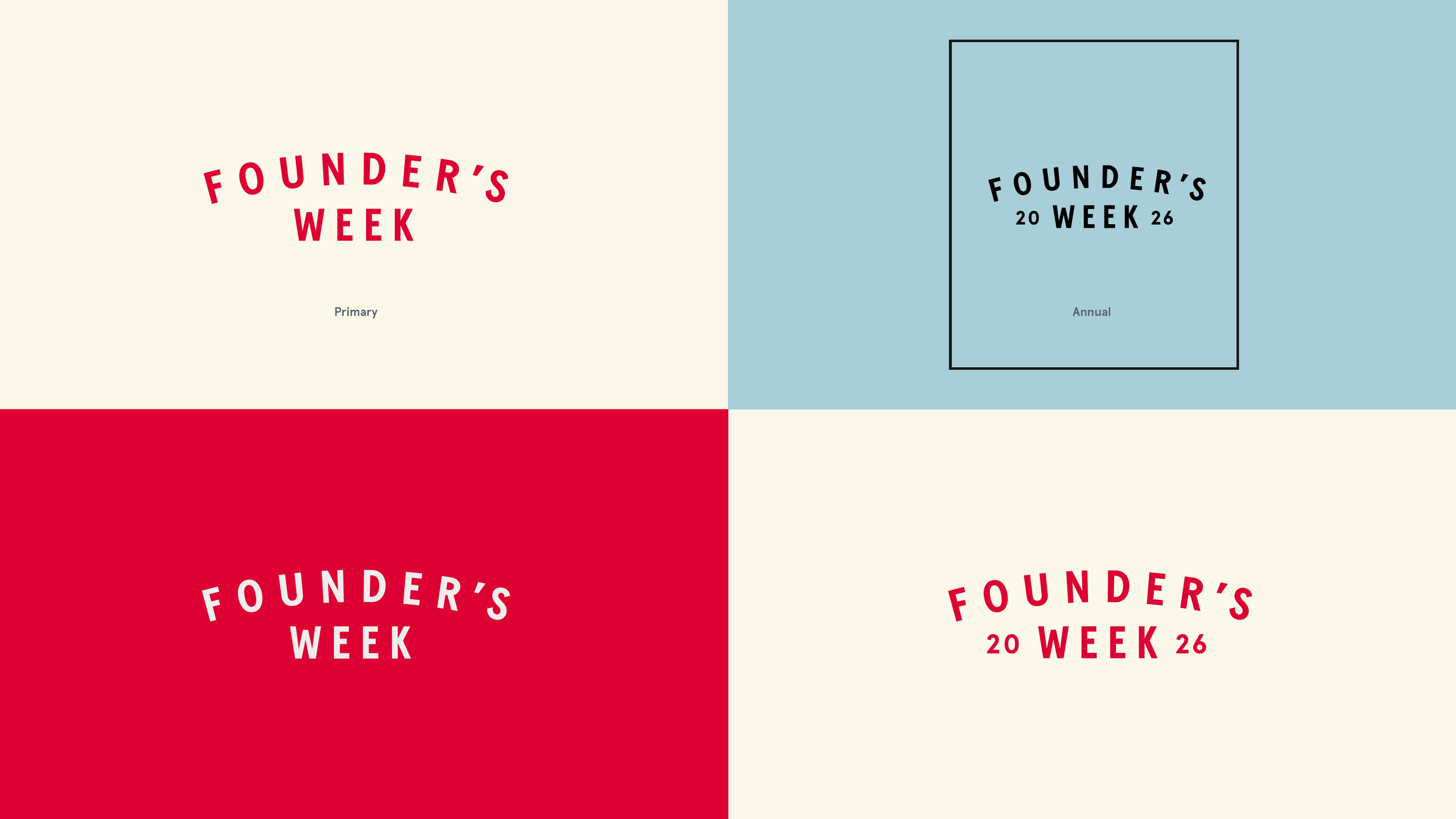
Sub-Brand Visual Elements
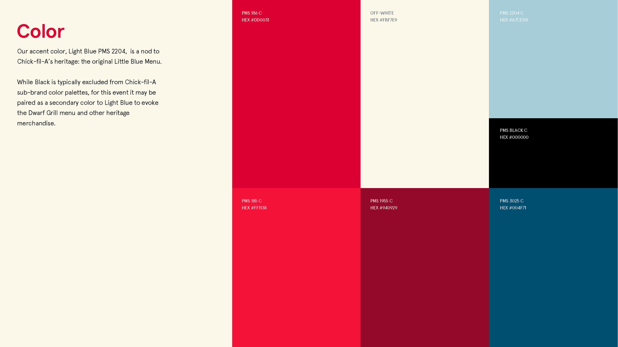
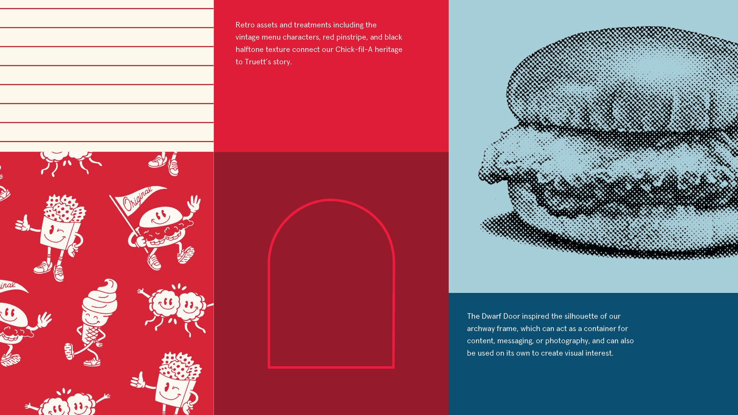
The event sub-brand’s visual toolbox includes guidelines for some of Chick-fil-A’s more guarded visual elements.
The BLACK color in the sub-brand palette is not found in the parent brand colors. Paired with the LIGHT BLUE, this color is a visual reference to the original Dwarf Grill’s ‘little blue menu.’

Sub-Brand Design System
and Guidelines
This year’s event needed to establish something new: a system that could last for the foreseeable future.
Black on Light Blue color pairing (inspired by Dwarf Grill menu)
Light Blue checkerboard pattern (inspired by Dwarf Grill counter)
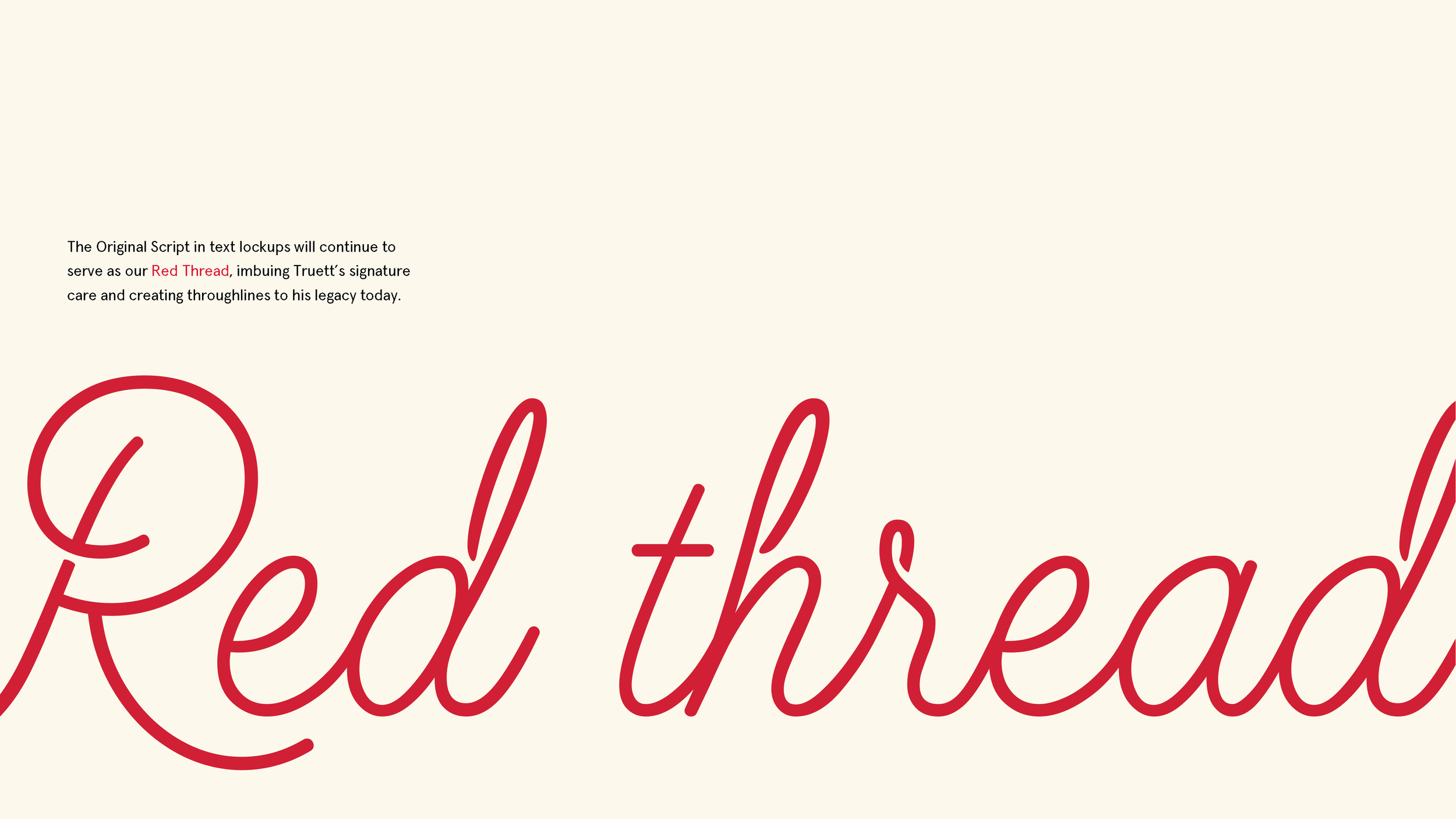
Refinement of the past “red thread” visual device into messaging lockups using
Chick-fil-A’s proprietary ‘Original Script’ lettering.System flexibility to embrace themed days and other heritage elements

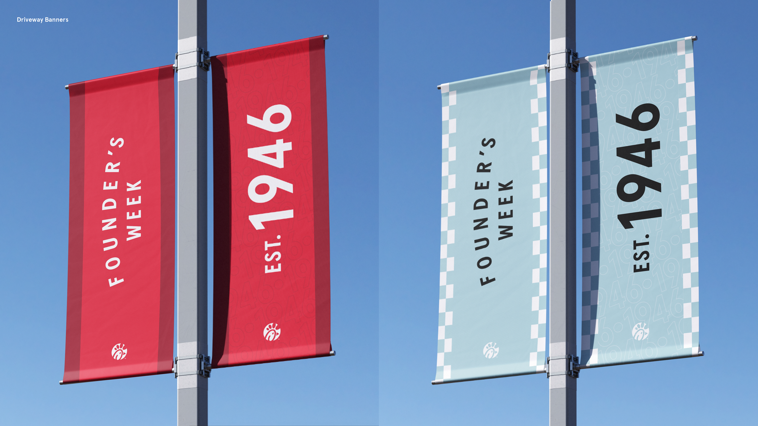
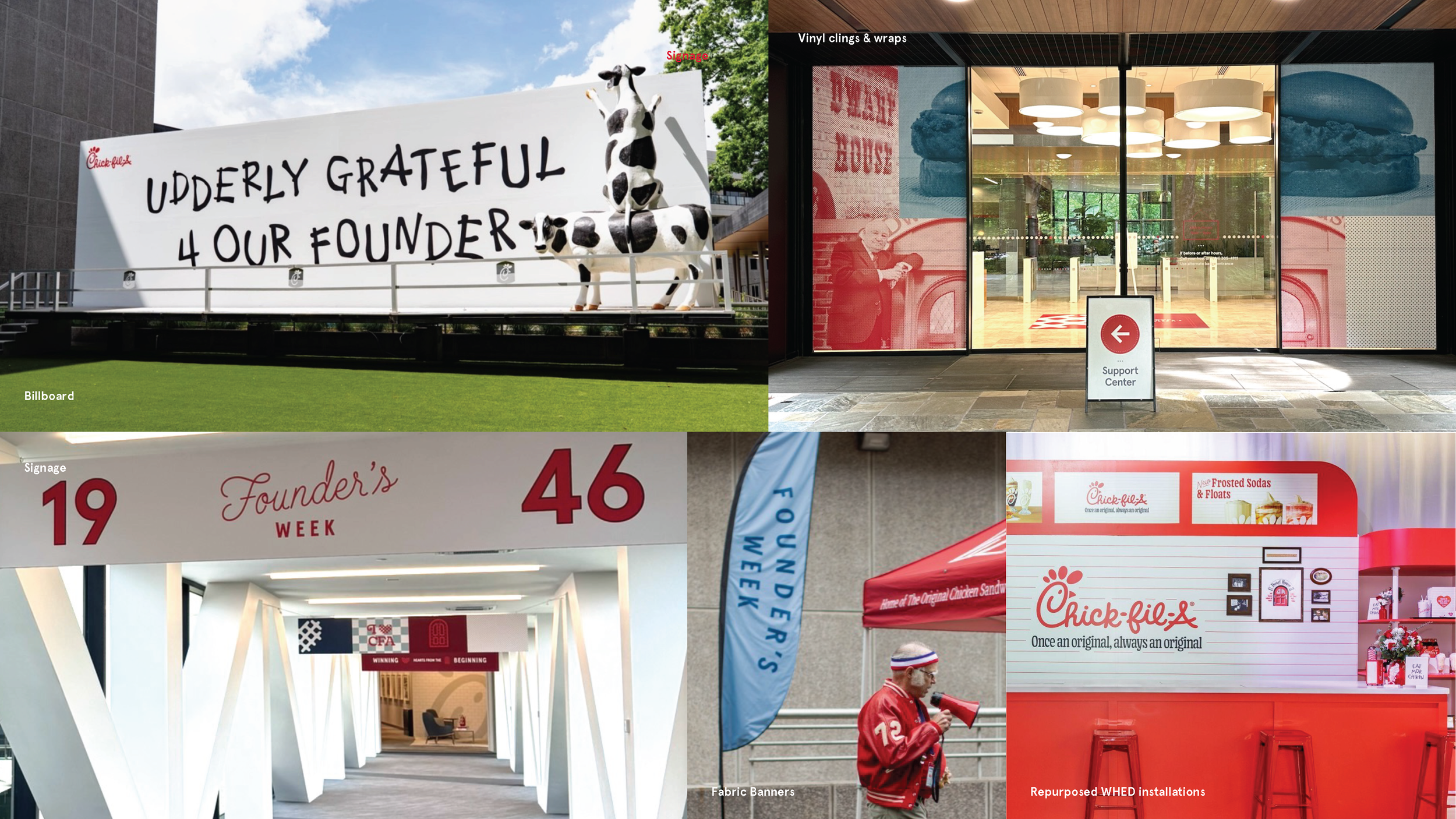

Campus Branding


Merchandise

Merchandise
The event’s limited run merchandise was an opportunity. With the flexibility of an internal-only audience, heritage brand elements (even those with less modern equity, such as our retired pointy-beaked ‘C’ logo) could reference visuals straight out of the Chick-fil-A Heritage Archives (some of our favorite internal partners on Staff).


Don’t try this at home, kids. Internal design teams only. This long-retired ‘pointy-beaked C’ logo is normally a loud and clear brand standards “no-no,” but this Staff-exclusive keyring intentionally pays homage to the diner-style booths of the Chick-fil-A Dwarf House.

Motion Graphics


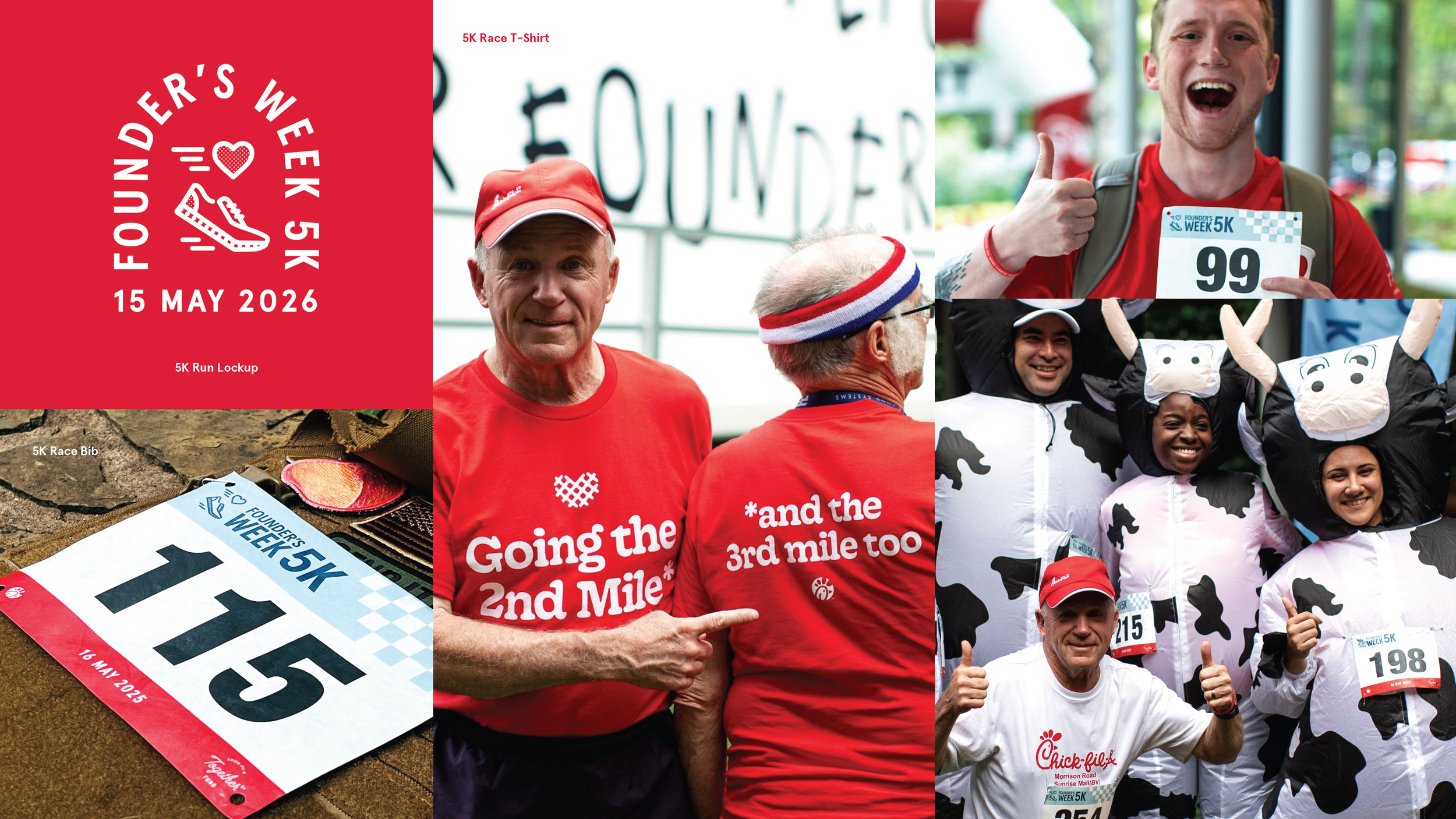
Founder’s Week 5K Tie-In

The week concluded with the Founder’s Week 5K — a Peachtree Road Race qualifier around the Buffington campus designed for seasoned and casual runners alike. All proceeds raised benefitted Chick-fil-A’s Together Fund relief.
For the first time, we partnered with event producer Running Nerds to print custom race bibs with Founder’s Week branding. Founder’s Week banners flanked the runners’ course and the Cathy family, as well as the Chick-fil-A cow, were on-site participating to tie up the week with a bow.

