


2021 // Client:
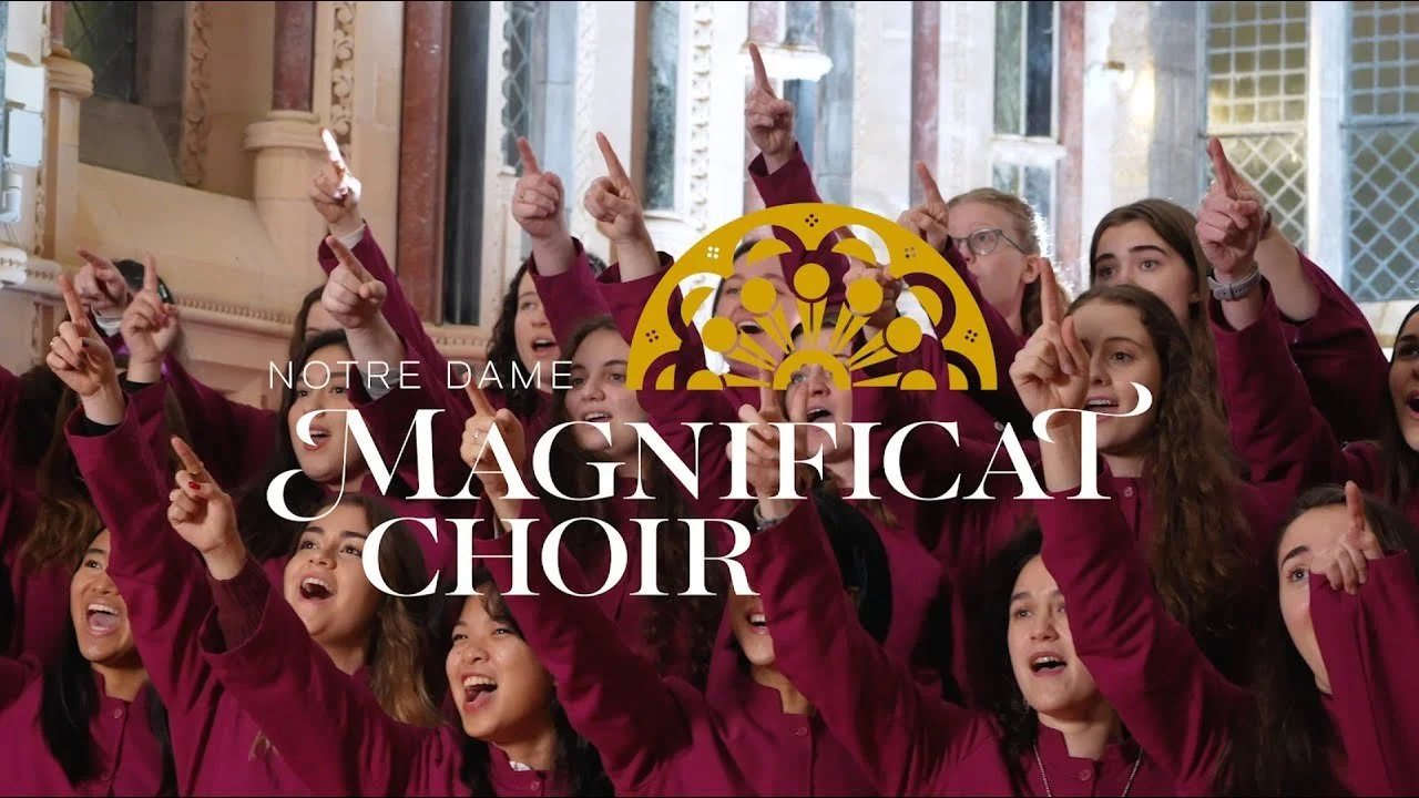
University of Notre Dame
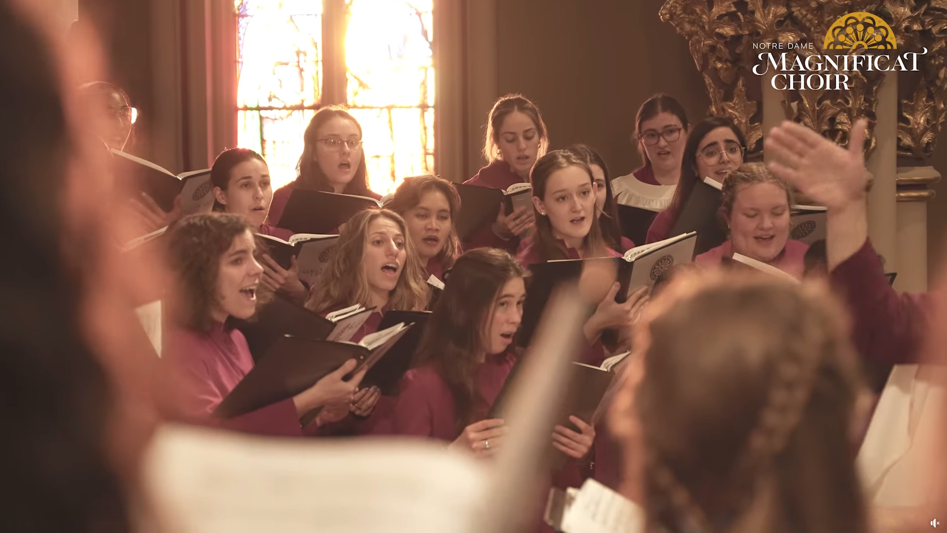
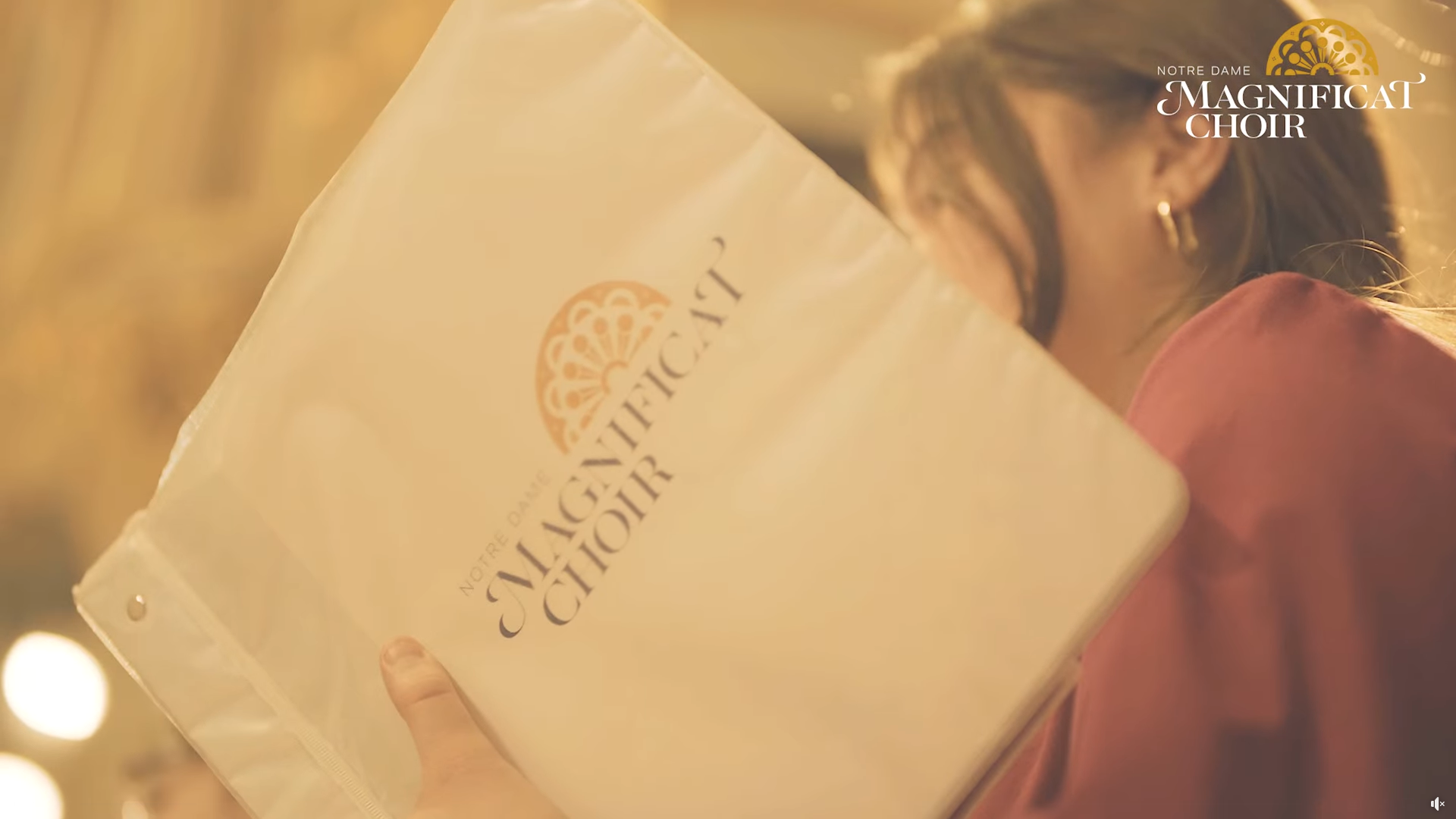
Brand Identity and Promotional Materials
Brand Identity
Logo Design
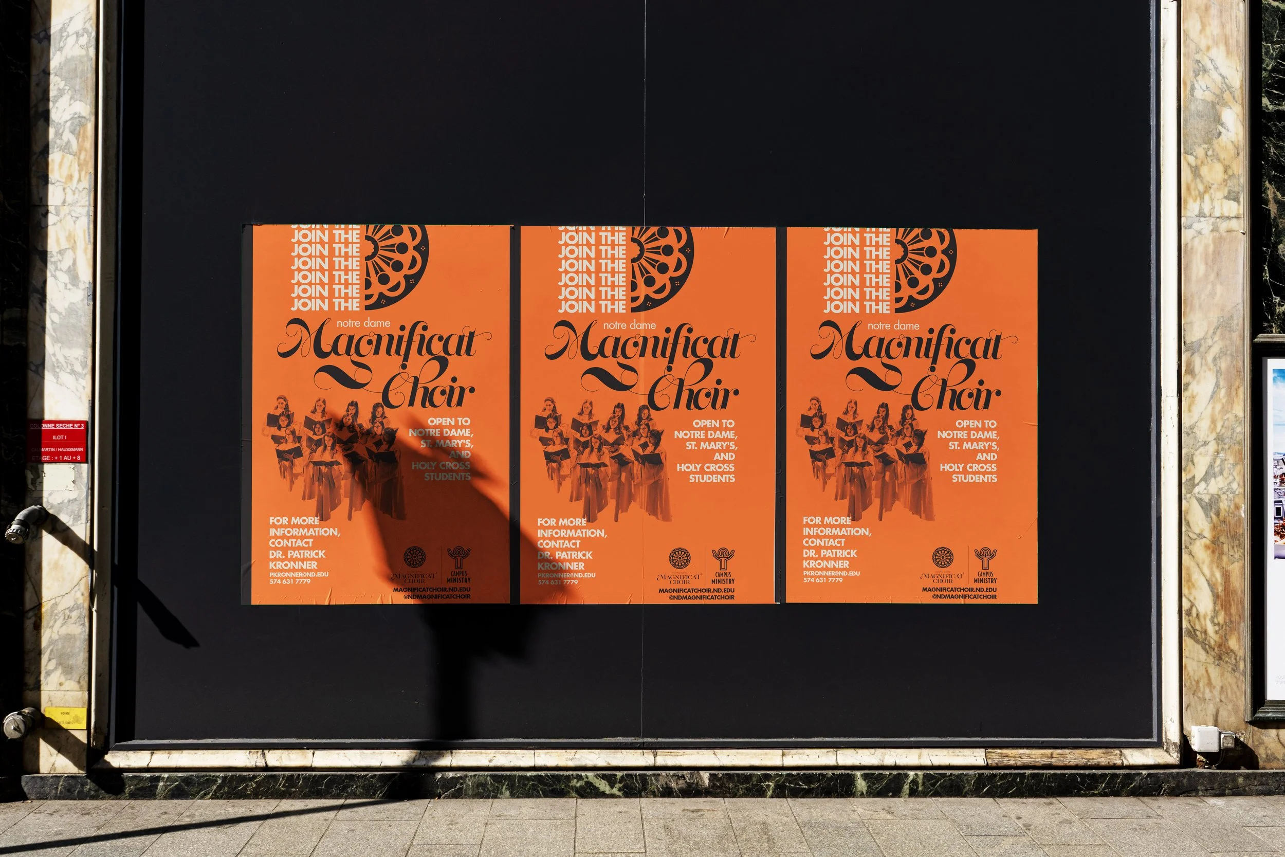
Print Design
Merch Design
-
Define the brand identity of a recently-reinvented institution that reflects the choir’s renewed values of diversity and inclusion while continuing to represent the union of treble voices that differentiate the Magnificat Choir from Notre Dame’s other established chorales.
-
Design a logo and collateral that convey the rich tradition of these musicians to a modern world, especially their audiences on international tours who haven’t encountered them before, while staying true to the groups values and creative influences.
-
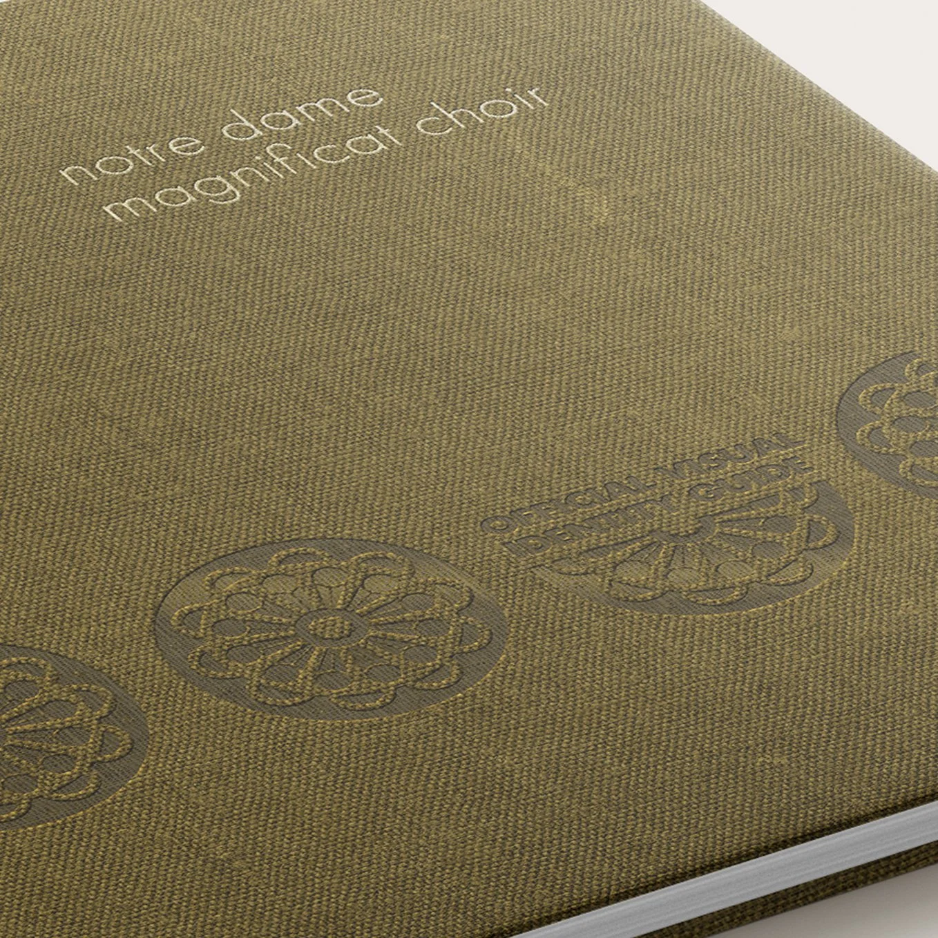
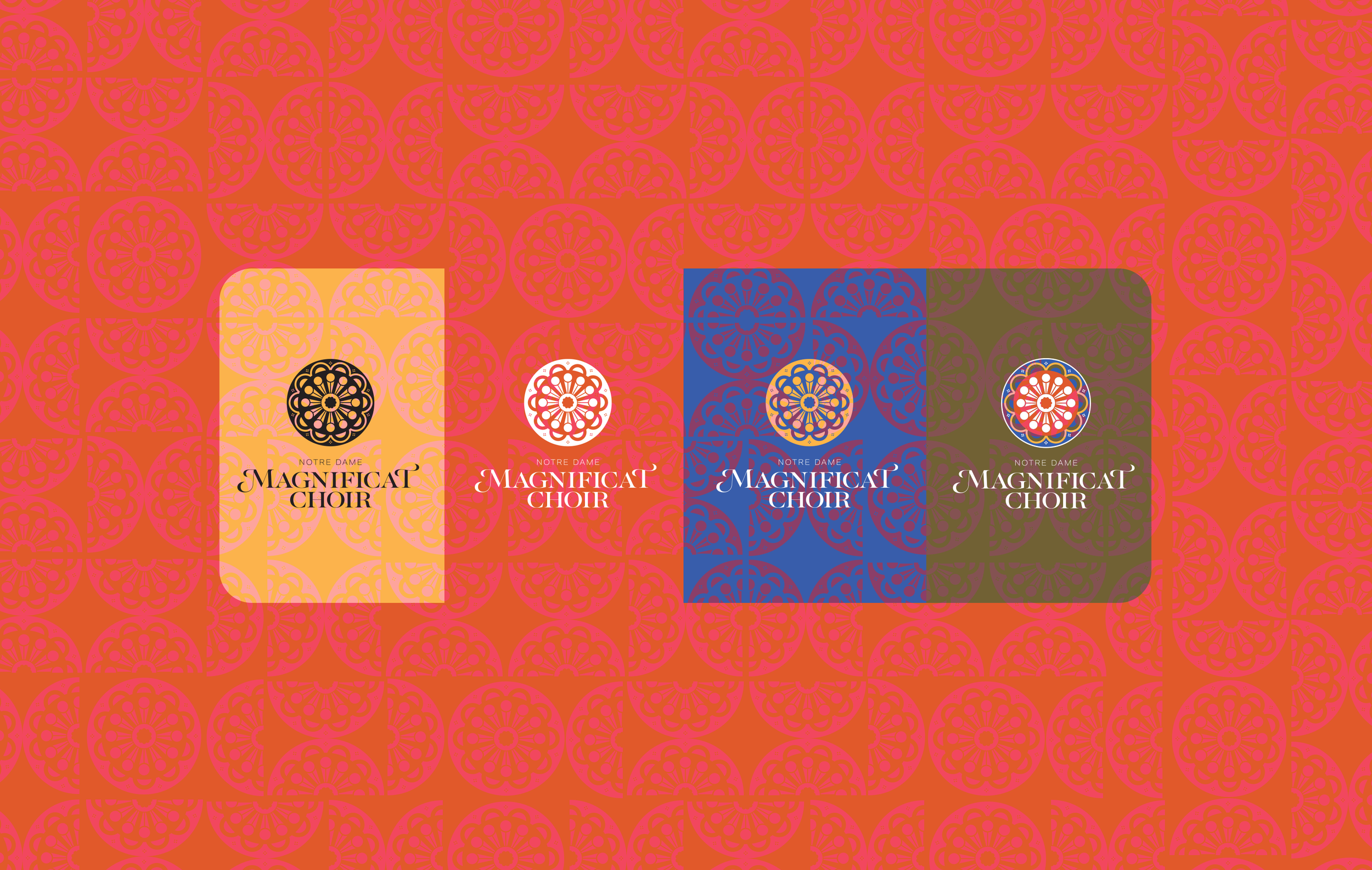
Bright, earthy tones from medieval art fuse with clean, modern geometry and sacred architecture to create this elegant but bold brand (to match the elegant but bold music of the all-treble choir).
Logo
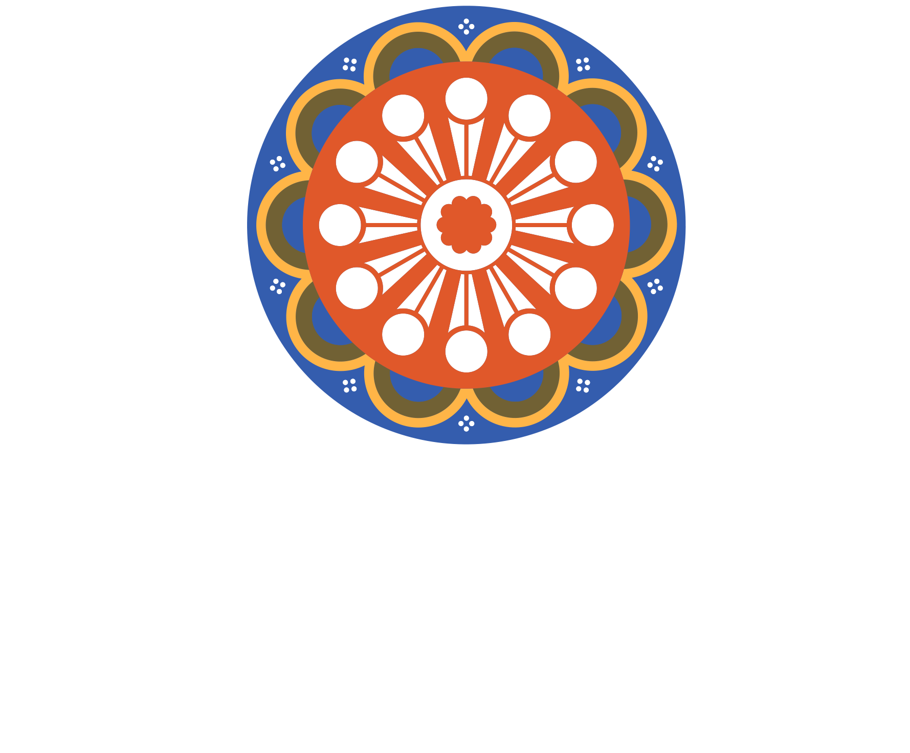
It’s since been known as “THE LEMON.” Consequently, the semicircular version on the horizontal logo variant is called “THE LEMON WEDGE.”
Classical music is more rock ‘n’ roll than you might think.
The colors and visual elements for the group’s new look went back to basics by looking back 900 years to one of their influences: Hildegard von Bingen.


Hildegard von Bingen. Scivias I.6: Choirs of Angels.
Read a feature on the Magnificat Choir logo design here.